- www.caparol.ge
- Aplication Areas
- Interior
- Inspiration
- Inspiration White
WHITE
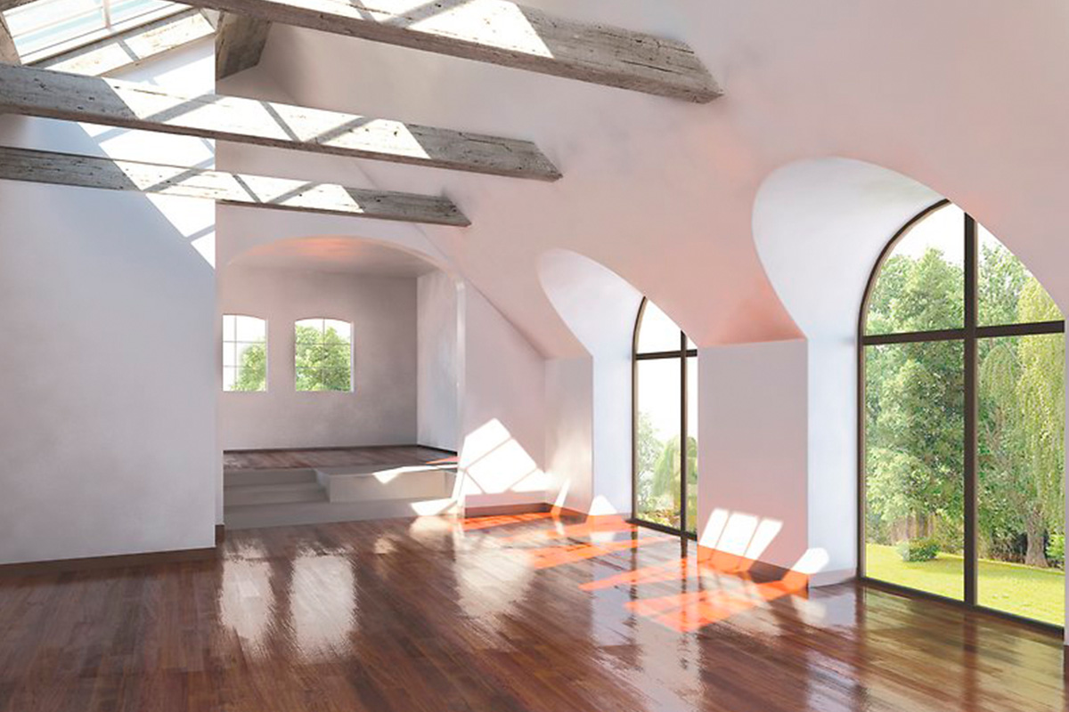
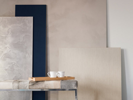
White is not always white - the fine nuances
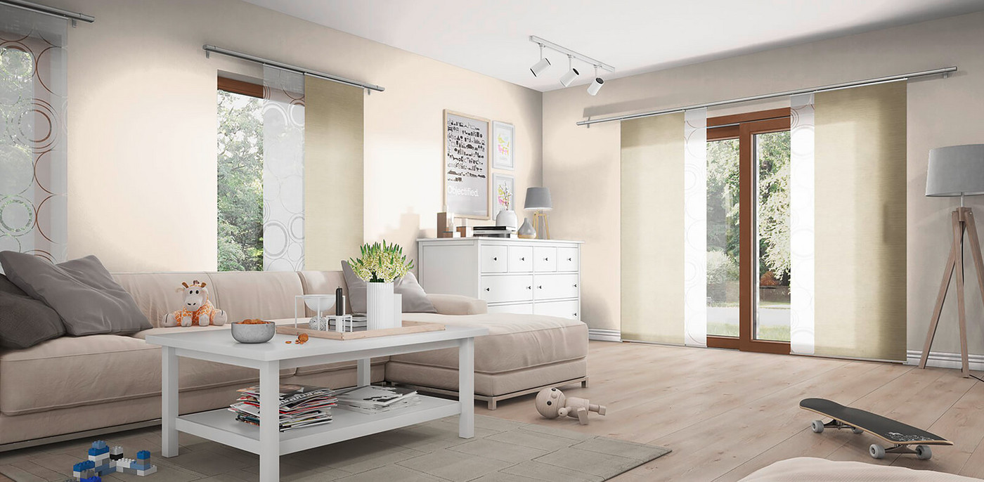
The color white is still in vogue. In recent years the demand for white tones has increased noticeably - and with it a special sensitivity for the different nuances. When designing a room with white, it is important to carefully consider which mood should be given to the room as a whole and which character should be given to the building element in particular. The multitude of possible degrees of whiteness is surprising, because doors, windows, furniture and radiators can be white and yet produce very different effects through their shades.
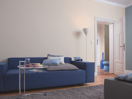
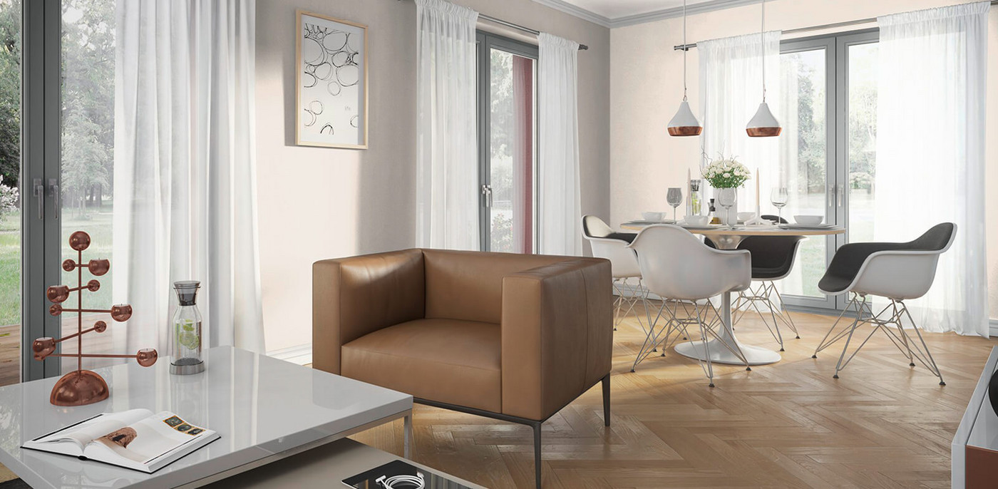
Classically elegant effect: reddish woods go very well with warm nuances such as off-white 15.

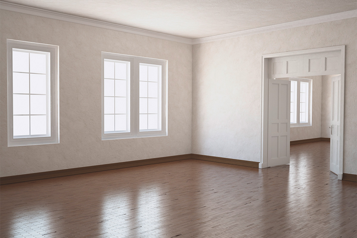
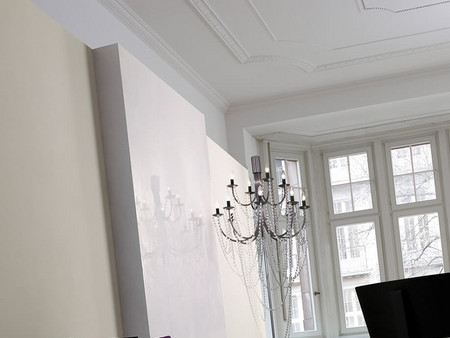
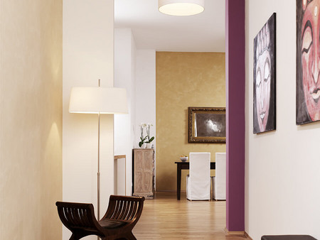
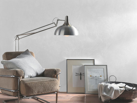
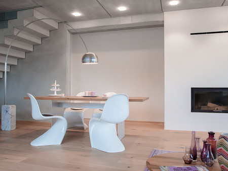
Purism meets classic: white room envelope in marble white and umber white combined with black furniture create an elegant atmosphere.
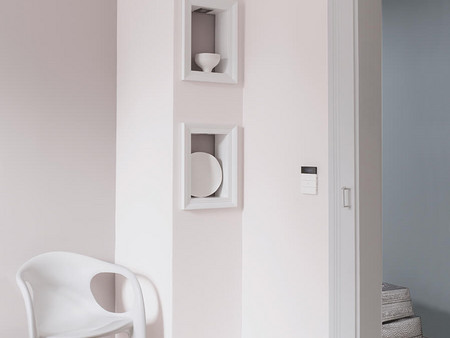
Finely tuned: the door frame in light white contrasts delicately with the creamy velvet white of the walls.
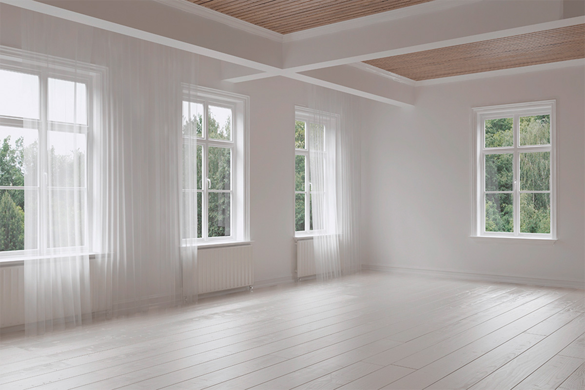
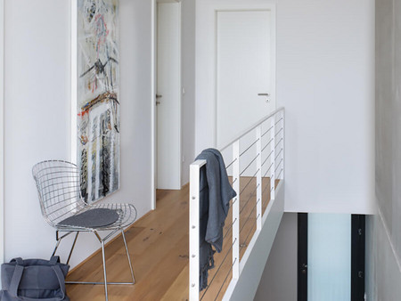
Surprising effect: the white floor and white walls in signal white are bordered in an unusual way by a wooden ceiling.
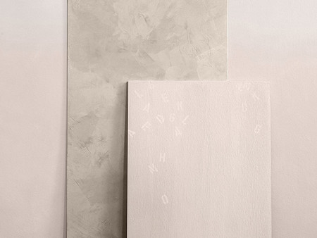
Neutral WHITE
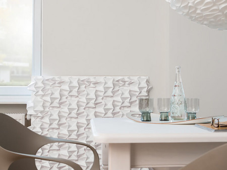
These white tones convey a high level of purity. They have a neutral effect and show no tendency towards a certain color tone.

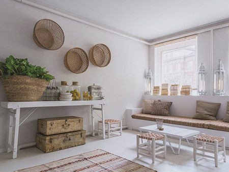
Warm WHITE
Slightly broken white nuances, such as antique white and light white, create a cautiously warm atmosphere with a classic character.

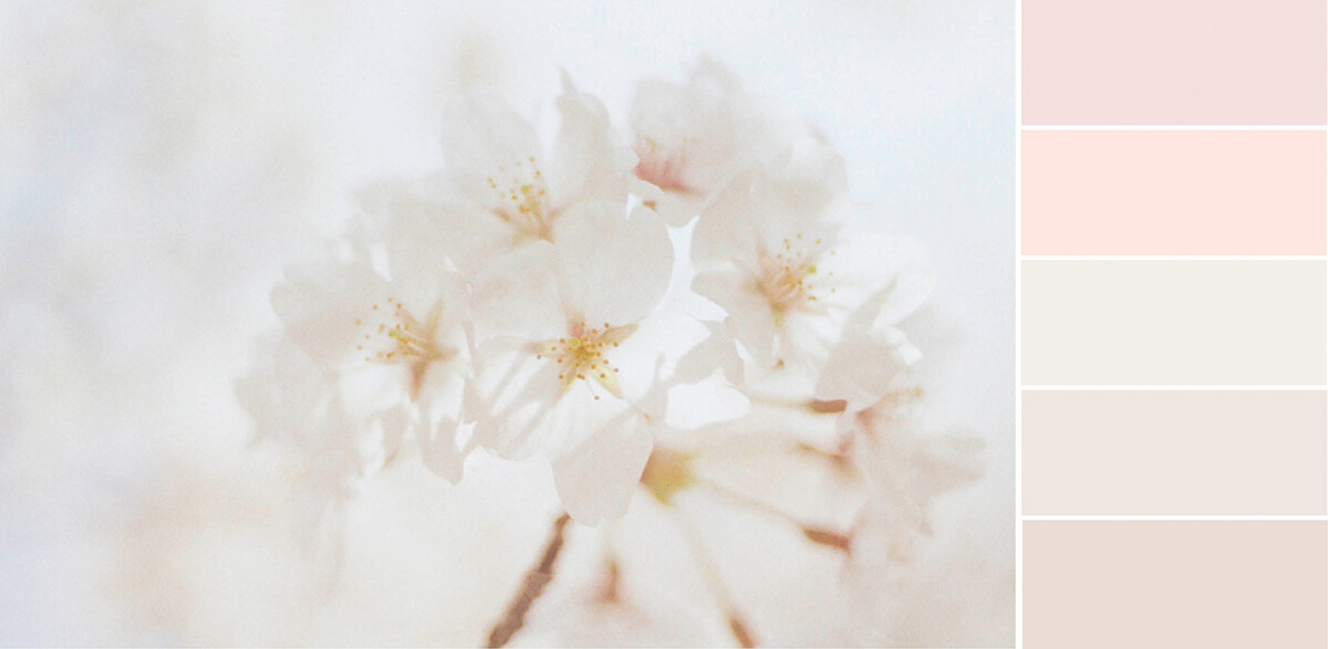
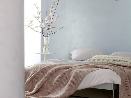
Rosé WHITE
Here are shown nuances of white from very delicate rose to very light old rose. Their covering makes them look stylish and elegant.
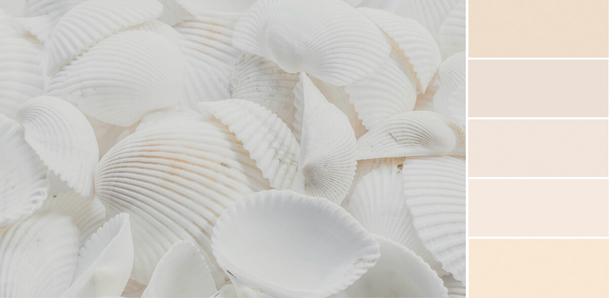
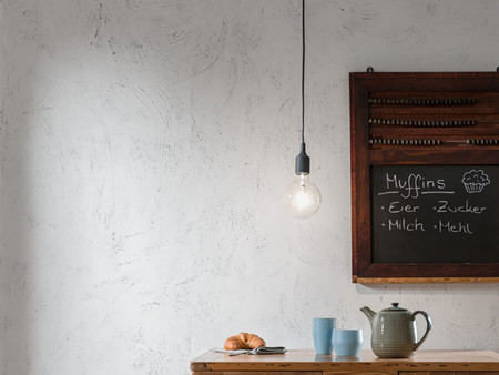
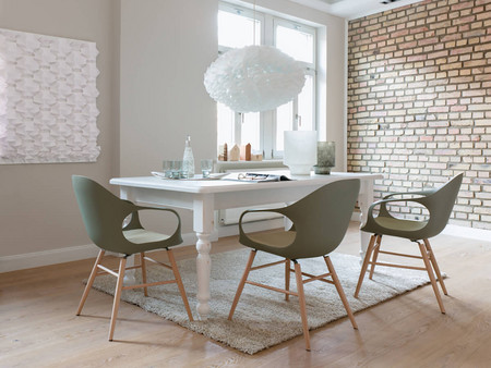
Cream WHITE
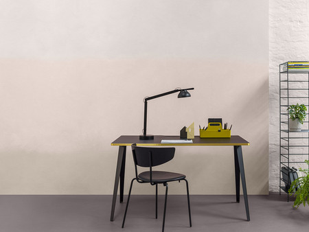
In this family there are white nuances that tend more towards the color of champagne. They are a little more toned, but still discreetly withdrawn.
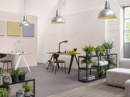
Fresh WHITE
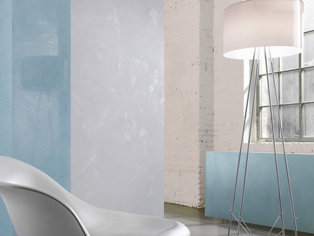
These more saturated white nuances from blue to green to yellow are fresh to cool in their appearance. They can be ideally combined with warm-toned materials (off-white nuances).

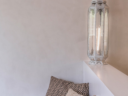
White Rooms
Play with degrees of gloss, nuances, light and shadow
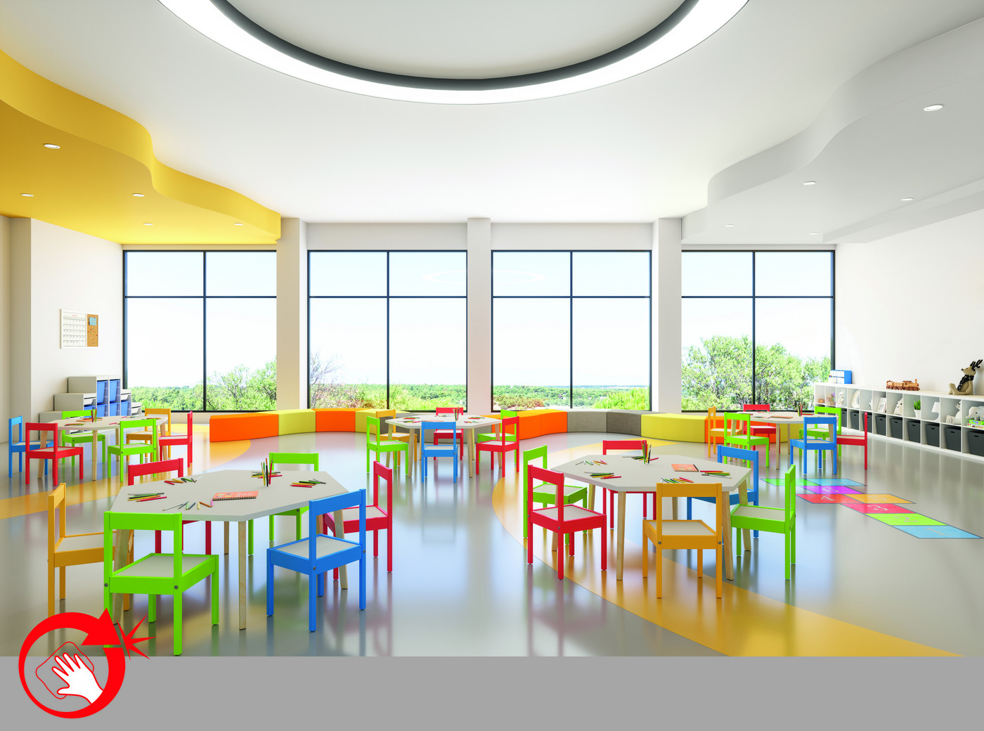
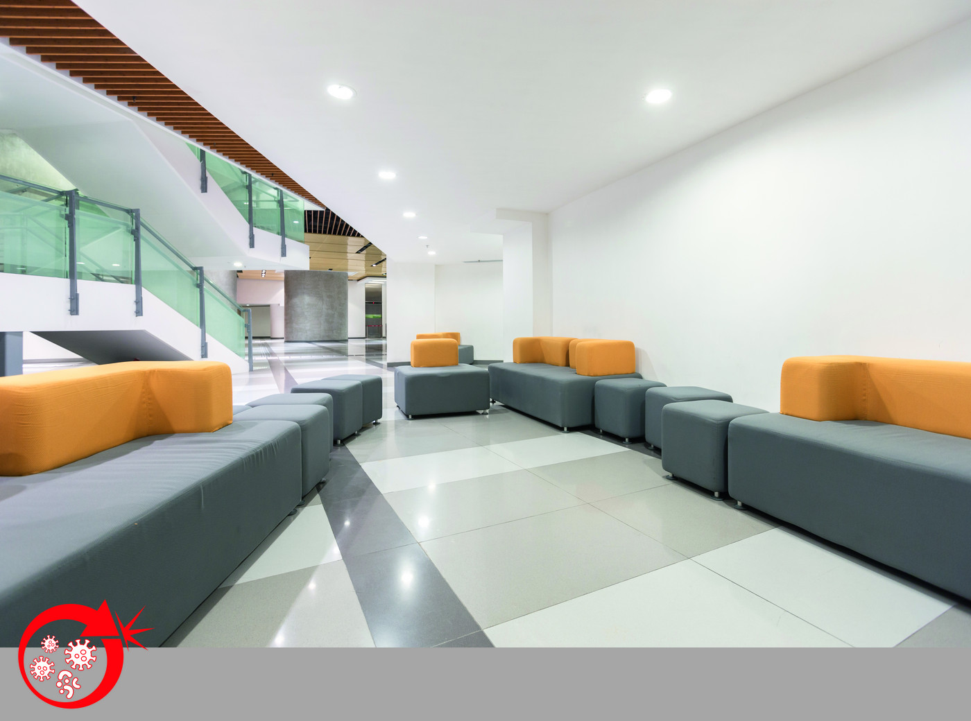
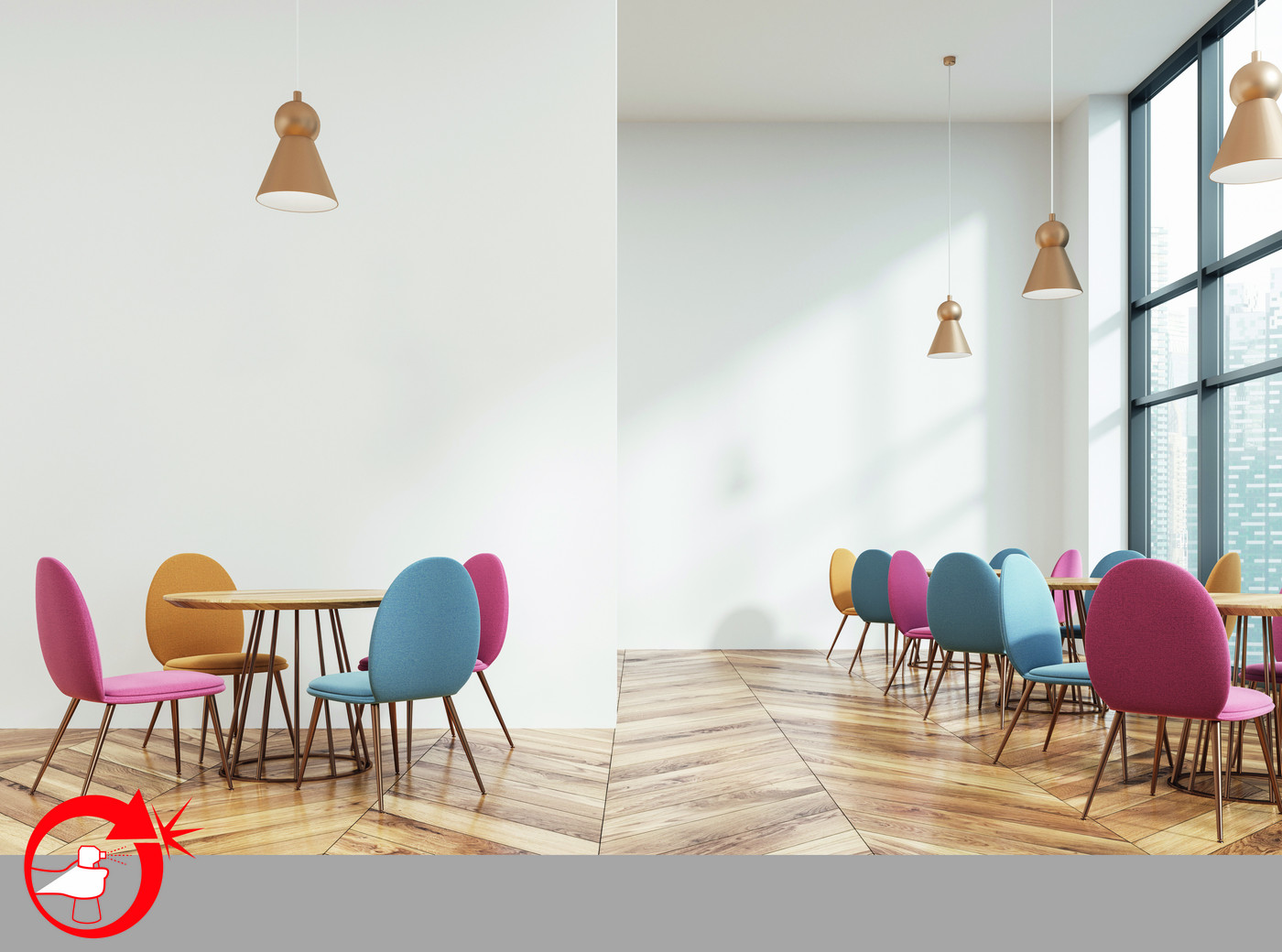
What color is hygiene?
White!
Bright white is still the most common interior color. And of course the highest demands are placed on heavily used walls, such as those in narrow hallways or areas around light switches. It is not just a long-lasting, attractive look that is required. The focus is also on wall hygiene, i.e. high cleanability, resistance to mold growth and protection against viruses and bacteria. Specially developed products from Caparol meet these requirements and offer the desired protection.