- www.caparol.ge
- References
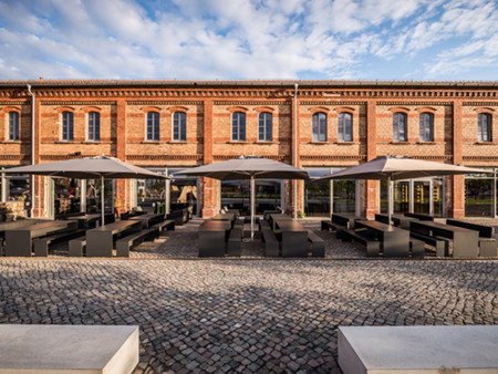
- Hotel/Gastronomy
- Gold-framed wine
Designer staged "Par Terre" vinotheque in Landau
Wine is a cultural asset - not only wine connoisseurs say that. Because wines carry the typical peculiarities of a region, a microclimate and the individual winemaking traditions.
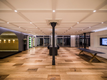
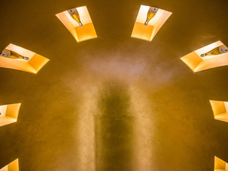
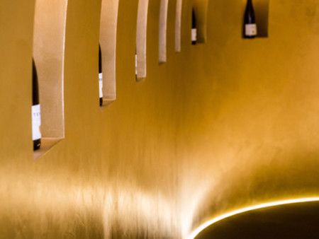
This is exactly what is celebrated in the Landau vinotheque "Par Terre" - with an ambience that is more like a gallery than a wine shop with conventional layouts. The conversion concept for this completely new type of presentation comes from the designLab by Michael Michalsky, the internationally renowned fashion designer Instead of arranging stacks of bottles, he focuses on staging the reduction: in the open, barely furnished showroom, the wine is lined up in glass climate cabinets or in backlit, golden-shining wall niches - tradition and innovation, that is, what the products of the southern wine route are is what characterizes the vinotheque with its custom-made counters for tasting and sales.
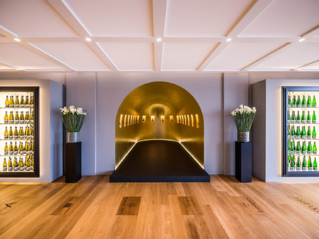
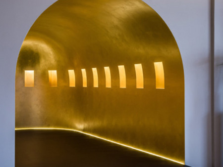
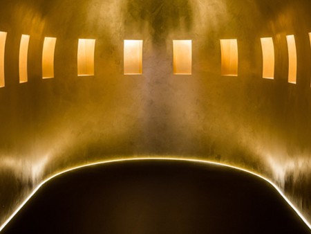
The color composition supports this elegant straightforwardness - it is reserved and light. The light gray ceiling with its adopted cassette combines the Michalsky concept with an expressive oak parquet and wall tones in "Greige". The designer contrasts this warm basic tone with a light but bluish nuance of anthracite on the wall with the climatic cupboards, and it is precisely this soft gray that forms the frame for the highlight of the showroom called the pantheon, where there was a stairwell that used to be an elongated, completely gold-vaulted vault that celebrates selected wines in individual niches In a sense, Pantheon is the heart of the showroom, fascinating in its space, euphoric thanks to its color.
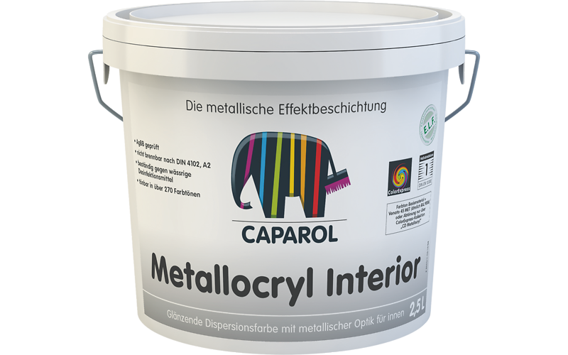
The planners put a lot of effort into realizing the shining gold, which was explicitly not supposed to be realized with gold leaf or metal. Rather, it was about being able to match and define the gold tone exactly to the overall aesthetic effect. The Michalsky office turned to Caparol's ColorDesignStudio: "We were looking for gold surfaces with a slightly iridescent look, subtle patina and a defined, traditional gold tone," says Sabine Hoffner from the ColorDesignStudio Capadecor Metallocryl Interior, with its brilliant metallic effect, ultimately proved to be the best product in elaborate coordination. After further variations and refinements, the Palazzo 215 color was fixed, as was the application method, because the special geometry of the approximately 30-square-meter vault also contributed Caparol application technician Volker Bastian provided the solution in the form of a three-layer application: “Each layer was first presented with a medium-pile roll and then with an additional rounded rubber putty warped in the cloister ", says expert Wolfgang Reichling, who together with his colleague Volker Bastien contributed to the realization.
So that the fascinating gold effect really comes into play, the precise preparation of the surface must not be missing. The contracting company Wind from Knöringen - like most craftsmen coming directly from the region - spatulated the vault made of plasterboard in the premium level Q4, which was expertly installed by the drywaller, then primed with CapaSol LF and then spray-coated an amphiboline layer in the color of the subsequent gold frame .