- www.caparol.ge
- References
- Hotel/Gastronomy
- Dorint Strandresort & Spa Ostseebad Wustrow
Dorint Strandresort & Spa Ostseebad Wustrow
Relax, regenerate, gain new strength: A stay in a spa and wellness area has a positive influence on physical and mental well-being, especially through the invigorating effects of water. It plays a central role in wellness facilities with pools, saunas and massage, beauty and fitness offers. Warm water is perceived as pleasant, movements in the water are easier, slow swimming or just "drifting" relaxed.
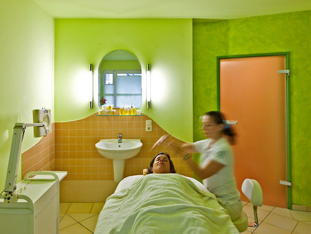

Natural feel-good atmosphere of the beauty and wellness landscape
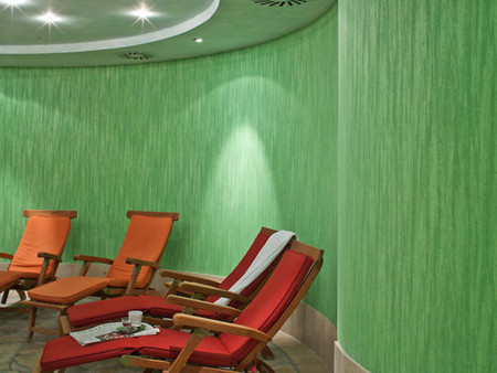
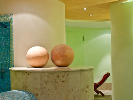
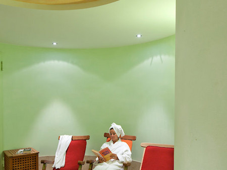
Water is nature - and in the spa and wellness area of the Dorint Strandresort in Wustrow this topic plays a special role, because it is located directly on the Baltic Sea. That is why the closeness to nature should also be expressed in color. So earthy, sandy and green shades dominate around the blue of the water. Lively, strong accents in red, turquoise and gold complete the color palette.
The shades were selected on the basis of feng shui analyzes. Depending on the location of the premises, the design takes into account the influence of the five elements of classic Feng Shui: fire, earth, metal, water, wood. The optimized interplay of these elements creates balanced, pleasant room atmospheres. The particularly successful design result came about through the dedicated collaboration of the Caparol color design studio with qualified designer Petra Ruhnau and feng shui consultant Monika Berthel. Contemporary color design in dialogue with traditional Feng Shui teaching led to an innovative color concept for the entire Baltic Sea resort of Wustrow. The concept for the spa, wellness and cosmetics sector has been successfully implemented so far.
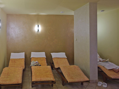
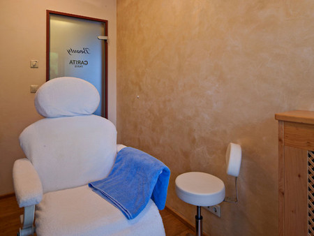
Relax with all your senses - massage and cosmetics
Green shades of color create a very natural-looking environment in the massage rooms. The surfaces were created using a dull matt spatula technique (Capadecor ArteTwin), which offers haptic stimuli through its rough structure and evokes associations with natural materials. In combination with the newly laid bamboo parquet, a mediterranean atmosphere is created. In the cosmetics sector, the elegant wall surfaces with pearlescent effects reflect the value of the subtle treatment and the selected products.
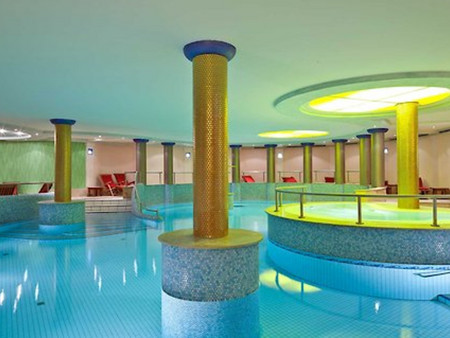
Immerse yourself and let yourself drift - spa and wellness
The lively, varied colors and shapes of the bathing area in the basement of the hotel complex invite you to linger a while. The central water basin, which is framed by golden tiled columns, is particularly impressive. The contrasting, fascinating play of colors radiates joie de vivre. This "rubs off" and promotes the bathing pleasure and the movement of the guests. Everyday worries are quickly forgotten here, because the atmosphere has something unexpectedly beguiling in the "underworld" without daylight. "1000 and a night" send greetings, the imagination is gently stimulated. This dream setting inevitably leads to distraction and relaxation. The reading and relaxation area is particularly intensively illuminated and easy to read and makes the lounging oasis appear radiant. The textile-like glass fleece awakens with its design Associations to a real bamboo grove. The integrated whirlpool is staged by a special light installation. The bubble bath can be enjoyed as if under yellow sunshine. The sophisticated lighting of the entire bathroom area and the watery, transparent colors, which are combined with a few strong accents, characterize the extraordinary But the diverse mix of surfaces also makes the wellness and beauty area a striking place, with shimmering and matt wall and ceiling surfaces alternating with different structures and colors.
It is precisely these exciting combinations that illustrate what makes good Feng Shui and color advice. The design concept of the wellness hotel is an example of the successful implementation of the underlying harmony of Feng Shui with sensitively selected colors and materials. Feeling good and switching off is not difficult here. And so that sensitive, allergy-stricken people do not have to fear any health impairments, the mineral Sylitol organic interior paint has been used for opaque coatings. Thanks to the allergen-controlled recipe, painting with this color ensures a healthy indoor climate. On accent surfaces in the wall and ceiling area, DecoLasur has been used in many different tones or also transparently finished with pearlescent pigments as a protective top coat.
The hotel guest is able to experience different worlds of color and well-being and to feel which color moods he finds particularly beneficial. Delicate glazes, lively spatula techniques, pearlescent sheen, metallic shimmering and matt-opaque surfaces stimulate the senses and feel, while at the same time providing orientation, experience and relaxation - here the guest is the focus. In the fairytale-like bathroom atmosphere, he even becomes king!
Products Used:
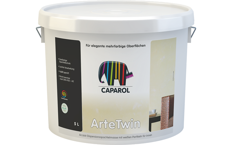
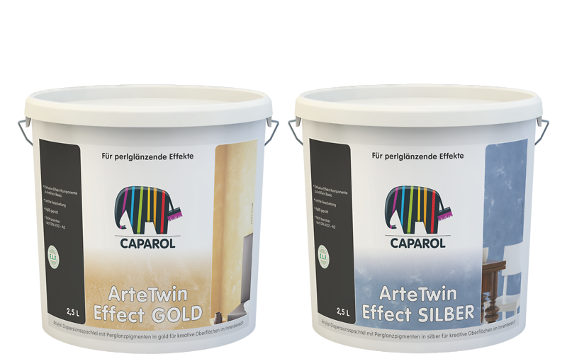
Capadecor Calcino Decor
Capadecor Metallocryl Interior